

Local Authority Budget Comms Toolkit
A guide to better data visualisation and storytelling for communications professionals
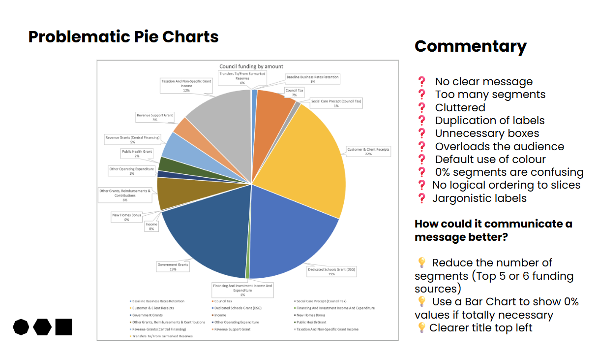
AI and ever more advanced software tools are making it a cinch to create fancy, advanced, colourful visualisations from sets of data.
In the last few years, I’ve seen evidence of these tools being used to communicate visually on financials like income and spending. Some I’ve seen have the hallmarks of production by corporate services or finance colleagues (in good faith), and then used for public communication.
In a frenetic, pressurised, politicised - often under-resourced - dash to ‘get stuff out’, do communications objectives get forgotten? Is there a risk of pumping out more pretty-looking corporate noise, which ultimately fails to land the important messages?
The examples in this guide are compiled from a search for local, regional and sub-national budget visualisations, collected using a Google Image search. All have been anonymised. They are mostly from the last few years. They have appeared on web pages and some have been used on social media.
In compiling this guide, it is my intention is be helpful; to pull out examples and make suggestions on why they work or how they could be improved (in my opinion). I don’t claim all the knowledge, and others may disagree.
My starting point is that everyone involved in the formulation and production of the examples has worked in good faith, in challenging circumstances, and to the best of their ability at that time.
I’m aiming to stimulate more fundamental and strategic thinking about how we use data to shape public understanding and discourse. Visual budget communications are one part of this, but I think it runs much wider. If you have your own good examples to share, please do get in touch.
Features
- 40-pages
- 30 examples from local, regional and sub-national budget comms
- Strengths, weaknesses and ideas for improvement
- Practical advice that can be implemented immediately
- Covers pie chart, donut charts, bar charts, treemaps, waffle charts, bubble charts and other styles of data visualisation
Benefits
- Clearer communication of numbers
- Improved public understanding
- Enhanced reputation
- Time saved
- Professional development for your comms team
The full Toolkit was sent to my current clients and collaborators, and has already had some great feedback.
But I have also produced a free taster version, which you might find useful - please do feel free to share.
The full 40-page version is available for £349 and includes a 30 minute online consultation. Drop me a line if you want to know more.
I’m making freely available a taster version of my guide to better data visualisation and storytelling
Features of the full version
- 40-pages
- 30 examples from local, regional and sub-national budget comms
- Strengths, weaknesses and ideas for improvement
- Practical advice that can be implemented immediately
- Covers pie chart, donut charts, bar charts, treemaps, waffle charts, bubble charts and other styles of data visualisation
Benefits
- Clearer communication of numbers
- Improved public understanding
- Enhanced reputation
- Time saved
- Professional development for your comms team
The full Toolkit was sent to my current clients and collaborators, and has had some great feedback.
The full 40-page version is available for £299 and includes a 30 minute online consultation. Drop me a line if you