

Jack Leach 1* and the power of simplicity in data visualisation
To the right audience, this simple piece of data visualisation will send shivers down the spine. To others, it will mean nothing. 🤷🏻♂️
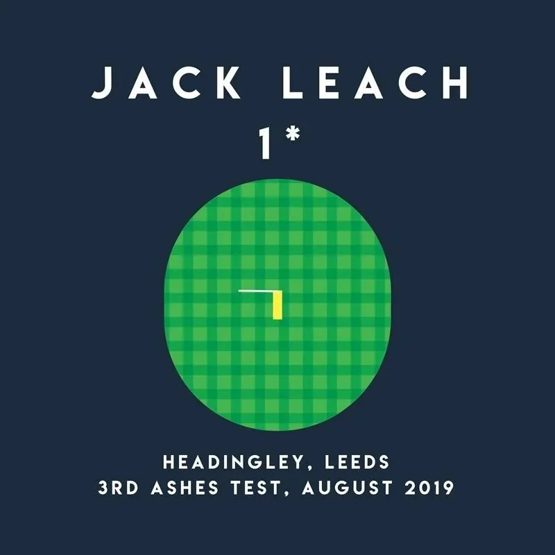
Where I see a lot of data viz used in communications (and by communicators) going wrong is trying to include too much, trying to make the graphic relay too many stats. As a result it hinders rather than helps the storytelling.
Watching Yorkshire demolish Somerset at Headingley this last week, with Jack Leach playing, 7 years on from a very famous cricketing day, reminded me of his now legendary 2019 ‘wagon wheel’ of scoring shots.
A simple stat and a date. To the right audience (millions of England cricket fans) it’s pure goosebumps stuff, setting off a heady maelstrom of emotion and drama.
A name, a stat, a date and a place, to evoke a huge groundswell of pride and emotion. Ask any cricket fan where they were, they will almost certainly know.
To an England cricket fan, it’s probably the most famous, beautiful and important 1 not out ever scored.
And what the graphic doesn’t say anywhere is that Ben Stokes scored a scarcely believable 135 that day, to beat the Australians.
But that doesn’t need saying, and no additional cluttering needed. As cricket fans, we are already there, back in the moment. We see Stokes, playing an innings for the ages, and we are fully engaged.